Building a Better Viewbook
Viewbooks have been a staple in higher education recruiting since before your grandparents had to walk uphill both ways in the rain to get to class. You know you need one—but where does it fit into your school’s overall recruiting and branding strategy?
What’s the goal of your viewbook?
Once you can answer that question, it’s easier to determine what kind of investment should be made in your viewbook. The next decision is even bigger: What should it look, sound and feel like?
Start With Strategy
We generally recommend scaling your resources according to the kinds of prospects you plan to give the viewbook to. If your recruiting strategy dictates that only warmer prospects will receive a viewbook, you won’t need to print as many, so more money should be funneled into the design. For the highest quality, it usually entails hiring an agency or designer for a professional layout, graphics and content. To really turn heads with a viewbook, the top shelf of design considerations might include a custom die cut, nontraditional binding and heavier, high-quality paper stock. More on that later.
As a design firm with a history of successfully creating print collateral for universities, we will always advocate for letting in high-quality content and design take priority due to the staying power they provide.
Master Your Message
Modern higher ed marketing—like most modern marketing—should tap into the viewer’s emotions to create excitement and speak to the experience of your college. Viewbooks should aim to get prospects fired up about the idea of attending your college.
Densely packed informational viewbooks are (finally!) waning in popularity in favor of eye-catching, uniquely designed viewbooks with excellent feature photography. Why? Today’s traditional college prospects favor universities that offer the whole experience that they’re looking for, not just programs they’re interested in pursuing. These prospects are also far more likely to be drawn to schools with a purpose and social values that align with their own.
Piquing student interest in 2019 and beyond will come from invoking feelings, not facts and stats.
Leave Your Website Where It Belongs
Your marketing materials, for better or for worse, probably aren’t in the top-5 places that a prospect will go to learn about the school. That’s what your website is for (in addition to third-party reviews, social media, word of mouth and a slew of other sources). Prospects will take to the web to learn everything about things like a school’s programs, financial aid and housing.
Viewbooks need to reflect this.
Leaving the dense stuff on the web will free up plenty of real estate in your viewbook to leverage the culture and uniqueness of your school. Think of viewbook content as an emotional hook that emphasizes the environment, area amenities and non-academic things going on around campus. Promote the college lifestyle!
Design Tips
A lot of your school’s viewbook design will be driven by brand standards, but there are three main factors that should inform the design:
- Target audience
- Longevity
- Uniqueness
Target audience: Identify brands (not schools!) that your target audience engages with and incorporate design principles that they use into your viewbook. We don’t mean steal fonts or graphics from Nike or TOMS shoes—instead, borrow ideas like graphic styles, layouts and formatting or type treatments. Learn where you can push and bend your brand standards in ways that will surprise and delight your audience. In other words, give them something unexpected, yet familiar within your brand.
Longevity: Don’t think of a viewbook as something that will be eventually thrown away, but rather approach the design by asking yourself what you can create that prospects will engage with and want to keep. Today’s traditional prospects belong to Gen Z, and they prefer unconventional marketing materials that surprise and delight them. While every other school sends out the same 8.5” x 11” full-color printed viewbook, get creative!
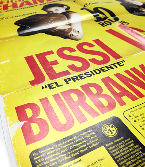
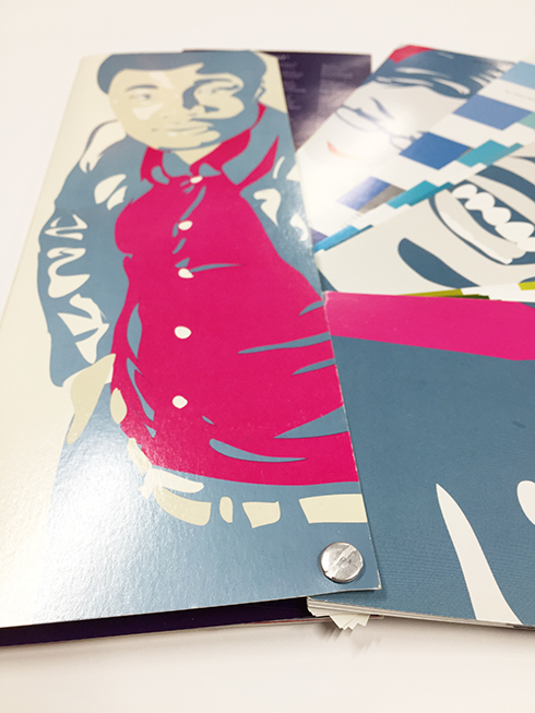
Nontraditional print sizes, die cuts (cutting unique shapes) and dynamic folds make a viewbook impossible not to engage with. Unconventional paper stock (like newsprint or poster paper) and printing styles (five-color vs. full-color, for example) create an irresistible visual-tactile experience. Don’t underestimate the intrigue you can create by going off script with even just one or two of these features.
Uniqueness: The easiest way to stand out with your marketing is by innovating, not emulating. This is especially true for viewbooks. Similar to researching popular brands among your target audience to borrow engaging design styles, also research your competition to give yourself a better idea of what not to do with your viewbook’s design. How can you expect a prospect to choose your school over your competition if your viewbook looks and feels like everyone else’s?
Inside the viewbook itself, the artwork and visuals can and should help push the overall uniqueness of the piece. Use original photography and illustrations (rather than stock) and manipulate them in interesting ways that fit your brand. Similarly, consider incorporating hand lettering instead of all text being in one confined font. Use layouts that are interesting and unique without sacrificing simplicity or readability. These added touches might require hiring a design professional, but they will be worth every penny.
Looking for more expertise on creating better college marketing materials? We’d love to start a conversation and provide more insight. Fill out the form below to get started.


