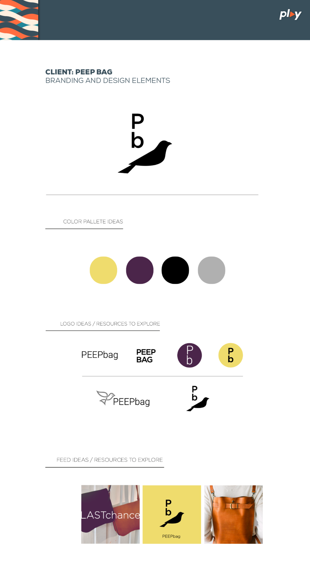
Peep Bag: Rebranding Proposal
PLAY Creative was tasked with rebranding PEEP BAG, a high-quality bag and wallet manufacturer. Our challenge was to align their visual identity with the premium nature of their products, enhancing brand recognition and market positioning.

The Challenge
PEEP BAG’s existing branding, centered around a simple yellow bird logo, failed to communicate the sophistication and quality of their product line. Our goal was to create a visual identity that would:
– Reflect the high-end nature of PEEP BAG’s products
– Improve brand recognition and memorability
– Modernize the brand’s image while maintaining its core identity
Our Strategy
- Comprehensive Brand Analysis: We conducted an in-depth examination of PEEP BAG’s current positioning, competitor landscapes, and industry trends.
- Preserve Brand Equity: We retained the iconic yellow color to maintain brand recognition while evolving the overall design.
- Logo Refinement: The logo was synthesized to create a more impactful and versatile design, suitable for various applications.
- Color Palette Expansion: We introduced complementary colors to create a more sophisticated and flexible brand identity.
- Versatile Applications: We developed a system for consistent brand application across various media, including social media and product packaging.
The Results
Our rebranding efforts resulted in:
– A more elegant and modern brand image
– Increased visual impact and brand recognition
– A versatile design system adaptable to various marketing needs
– A brand identity that accurately reflects the quality of PEEP BAG’s products
Key Takeaways
- Continuous Evolution: Brands must evolve to stay relevant and competitive in the market.
- Strategic Design: Every design decision should align with the brand’s core values and market position.
- Versatility: A successful rebrand considers multiple applications and platforms for consistent brand representation.
Infographic Ideas
- Before and After: A side-by-side comparison of the old and new logos, color palettes, and typography.
- Design Process Timeline: A visual representation of our rebranding journey from initial analysis to final implementation.
- Logo Versatility Showcase: Demonstrations of the new logo in various applications (e.g., products, social media, packaging).
- Color Psychology: An illustration of how the new color palette evokes desired brand attributes.
By refreshing PEEP BAG’s visual identity, PLAY Creative has positioned the brand for greater success in the competitive accessories market, ensuring it resonates with discerning consumers who value quality and style.

