3 Questions to Consider When Designing a Landing Page

It’s hard to create a quality landing page, but as a PPC agency, we’ve seen our share of websites. Consider these 3 questions and you’ll be set up for success.
Landing pages are a final destination for a customer to end up after clicking on your advertisement or other marketing links. They often lay out what your company does and offer greater insight into how you stand out from the rest of the businesses in your field. Even more crucially, they are designed to transform casual web users into actual customers. They are a part of your website, your online presence, and therefore should be seen as a section of your company’s identity.
Before jumping into the design of a new landing page for your website, it is important to ask yourself a few questions. As a marketing agency in Lincoln, we’ve helped multiple companies optimize their landing pages, contributing to the success of online advertising campaigns. We’re passionate about websites that work from both a design and content perspective and find that once you establish the answers to the following questions, you’ll be better prepared to create the best possible landing page for your needs.
1. What Are Your Goals?
This might seem like an obvious one, but it is crucial to understand the goals of your landing page and what you’d like landing page visitors to gain from the page. For example, are you creating a page in the simple hopes of gaining new leads thanks to a form lead generator? Once that goal is firmly in place, you will then be able to design and test your landing page around that goal.
And remember that there is no one way to do something. You don’t have to hold yourself to one set design. In their article about popular landing page designs, WordStream writes that “great companies reject what was called the ‘Tyranny of the OR.’ Instead, they embrace the ‘Genius of the AND,’ which refers to their ability to incorporate two extreme dimensions into their operations simultaneously.” This means that, if your goals are to both generate leads and to inform, your page can feature a lead form generator at the bottom of your page, the last thing that customers will see, and supportive, concise copy that explains your services and encourages readers to navigate through the page and to that form.

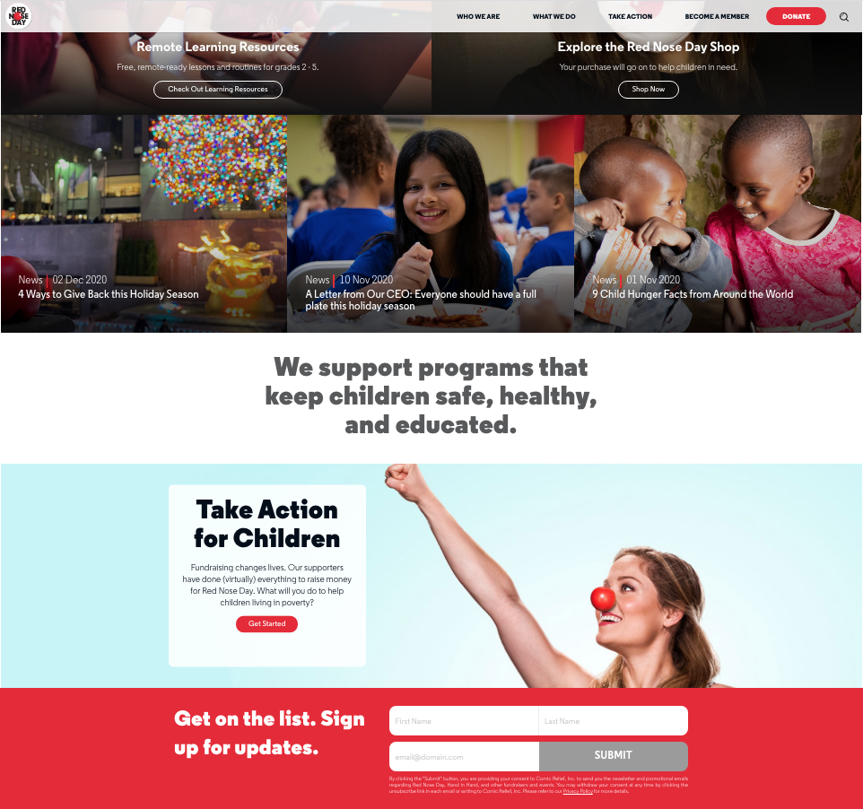
PPC agencies example of a landing page from Red Nose Day’s website.
Your goals shouldn’t overwhelm but you also shouldn’t limit what your page can do. So long as the information is well placed and takes the customer through a comprehensive journey, then you should have no problem gaining the customer’s trust and generating tangible results. Remember that it’s important to make your intentions clear, so the consumer ultimately knows what you want them to do on the page. We talk more about this in this article.
2. Who’s Your Target Audience?
The way you write copy depends almost entirely on your target audience and how you talk to your audience can vary from one marketing campaign to another. Consider who your audience is by taking into account what you’re selling, the price of your good or service, and who has bought a certain product or service in the past. Since it’s very likely your promotion, offer, or service is firmly in place before you make your landing page, you might already have a very specific target audience in mind. Just make sure to continue speaking to that audience throughout the length of the page.
HubSpot remarks that “a good landing page will target a particular audience, such as traffic from an email campaign promoting a particular ebook, or visitors who click on a pay-per-click ad promoting a specific campaign. So it’s important to build a unique landing page for each of the offers you create.”
By keeping your target audience in mind and making each new landing page unique, you are more likely to turn prospects into sales and conversions.
3. What Are You Asking of Customers?
Depending on what you’re offering customers, your lead capture form and CTAs might look very different from one page to the next. As anyone working for a creative design agency could tell you, no two marketing campaigns are created equal and the information on a landing page has to mirror that of the advertisement or email used to represent it. With that in mind, you must consider what you need from leads and what you are asking them to do in order to get the information you require. Let’s say you hope to gain more meetings with prospects. In that case, you would probably need an email address and ask for a brief overview of why they chose your company to help them with a particular problem. Taking it one step further, if you are asking customers to sign up for a paid, monthly subscription, your form will probably have a lot more space for home addresses and maybe even financial information.
Design your form and CTAs from the perspective of your customers. Would you want to fill out a big long form when the company really only needs an email? We’d guess not. Yieldify puts it this way, “Single-field lead generation forms will generate more leads, but longer forms are more likely to generate qualified leads.” Understanding what you’re asking from customers and matching that with what you need, will ensure you are creating the right forms and buttons for your landing page.
Personally, we like contact forms that ask a few relevant questions.
Once you ask the above questions, you will be able to market your offers and services better than ever before. Want to know more about what we do as a marketing agency in Lincoln? Reach out to us today!
