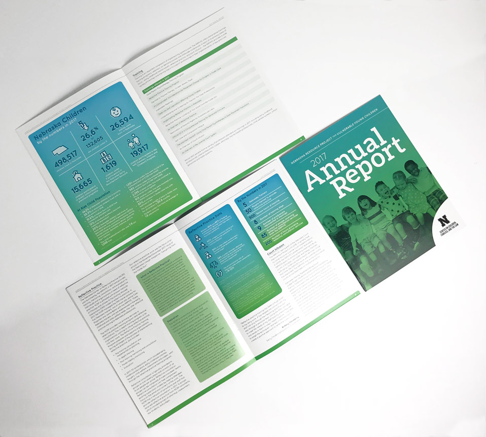
The Building Blocks for a Beautiful Booklet
What happens when you have information that you want to relay that’s too substantial for a pamphlet or brochure?
A booklet, of course.
The Nebraska Resource Project for Vulnerable Young Children (NRPVYC) does some incredible work and tons of valuable law research for the University of Nebraska. When it came to communicating all that info in a visually pleasing and easily read way, they knew they needed some expert design.
With all content supplied, we were able to focus entirely on design and layout and make it shine.
The project began with grouping all the content into categories to help with overall organization and understandability. With such a high volume of content, this proved key to the overall arrangement of the booklet.
We developed a mini set of brand standards for the booklet that we felt fit the contents of the research, including colors, layout style, iconography and infographic styles.
Once we had the brand, organization and flow of the content nailed down, we created a stylized set of icons that helped reinforce the content from a visual communication standpoint.
What started as a set of raw content and data eventually became the beautiful booklet you see above.
Do you have research, reports or a large set of content that needs to be beautified? Reach out to us to today to see how we can help.
